 Oh, honestly. I mean, that’s a typographical sin! I feel nauseated. I’m not sure how I can recover from this one. I mean, I’ve seen some pretty disgusting things in my time, but this is the pinnacle. A “friend” of mine sent me the link to it. I say “friend” because their status as such is now questionable.
Anyone who knows me knows about my “Comic Sans” issues. You can read about them
to gain a bit of perspective. What perplexes me is the inappropriate use of this dastardly font.
Now, tell me this…how seriously can you take this? I mean, honestly. I think I’d almost prefer to die of coronary failure. It looks like a practical joke…you apply the paddles and a recorded voice laughs and says, “sucks to be you!”. Comic Sans = trust fail. It does seems to be prevalent in the medical realm, perhaps in order to help people feel less intimidated…I perceive it as an expression of irresponsibility. I would reject services from any facility who used this crime against nature in their signage. Or at an ATM, or a restaurant…or make me question my personal safety if someone broke into my home or had me at gunpoint.
It just screams “we do not take ourselves, or your safety, seriously”. Or about whatever it is they’re trying to communicate. It’s like a plague…seeping into the cultural consciousness like a virus…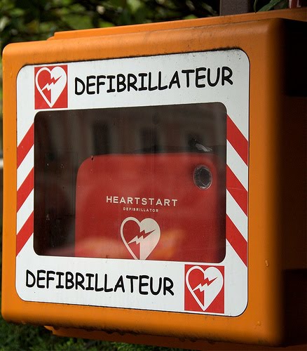
Papyrusis running an ever-increasingly close second in my font-hating inventory. I think they’re both ganging up on us. I don’t know what we need to do to defend ourselves against this typographical tyranny, but I feel it involves copious amounts of Helvetica, Arial, and maybe even a smidge of Times New Roman. Our very lives may depend upon it.
Voulez-voulez-vous

>You realize, of course, that these two fonts more closely resemble handwriting than any standard typeface. This is why people use them, the "personal" touch, because god knows typefaces are cold, metallic and technical. I don't condone it, except for effect (which is, apparently, swiftly losing it's effect). It's hypocritical to use a keystroke to simulate the very thing it was meant to replace. Bastards.
LikeLike
>Guess you haven't seen Avatar
LikeLike
>Oh, but I have. I cringed.
LikeLike
>To her point, at BEST, Comic Sans is supposed to be used for "comic" things.You know, like police explaining difficult choices to people who have just been raped…
LikeLike
>This made me laugh and wonder at the typographical world around me. You are funny, and I will follow you (yes, in that stalker-through-the-interweb way). I like your writing, it's what I imagine the internal monologue in my head would sound like. Carry on then.
LikeLike